
Avida
Branding, Website, Video, Campaign
Artistree
Branding, Website, Campaign

xlab
Branding, Website, Sensory Experience

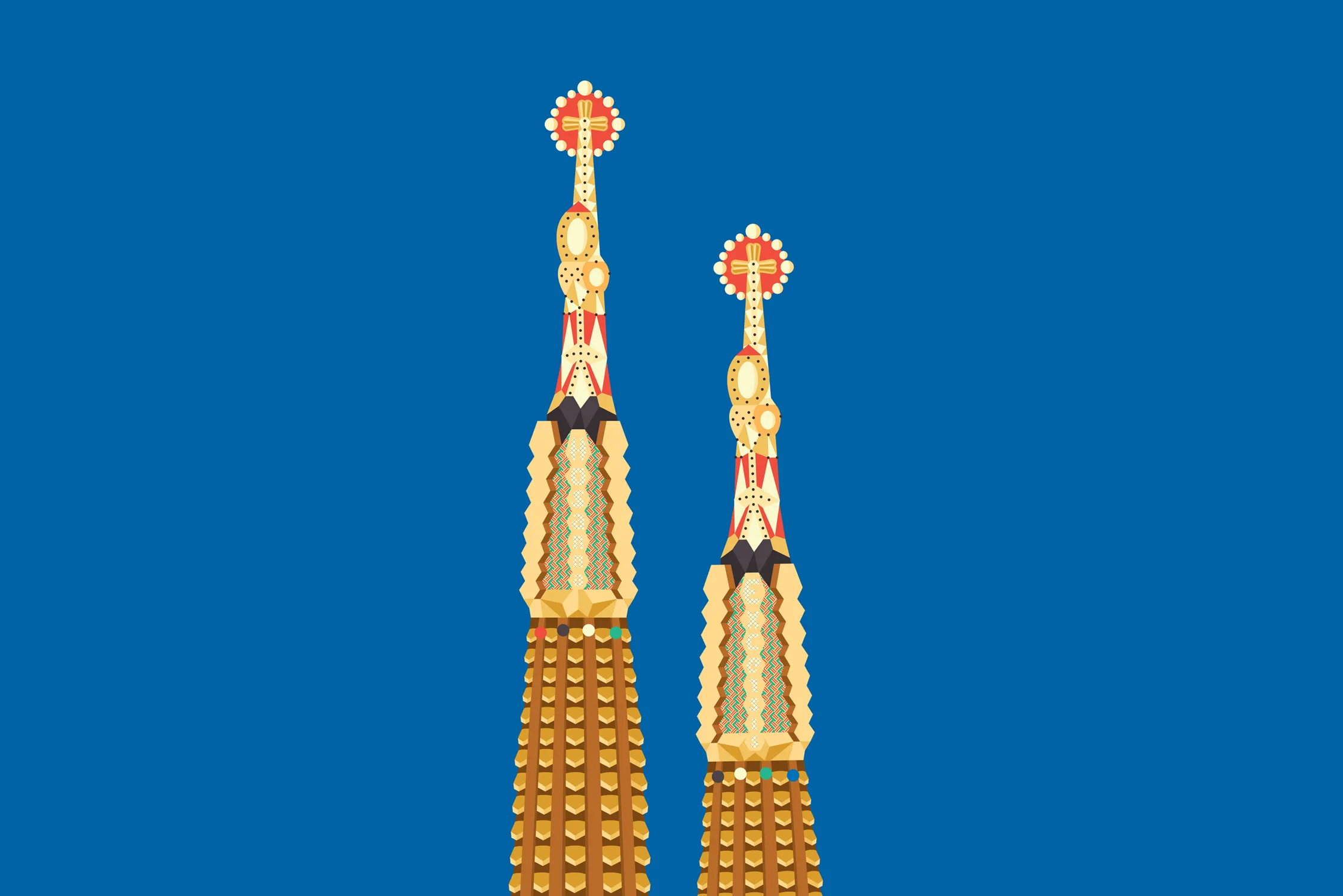
Portal to the Arctic
Interactive Experience
Team Study
Branding, Digital Product, Campaign
Design Thinkers
Interactive Experience

Omnivore's Feast
Interactive Experience
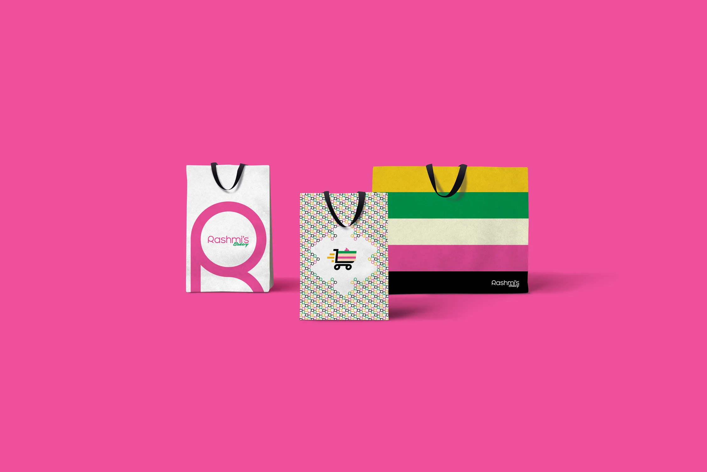
Rashmi's Bakery
Branding, Packaging, Campaign
Alquemy
Branding, Website
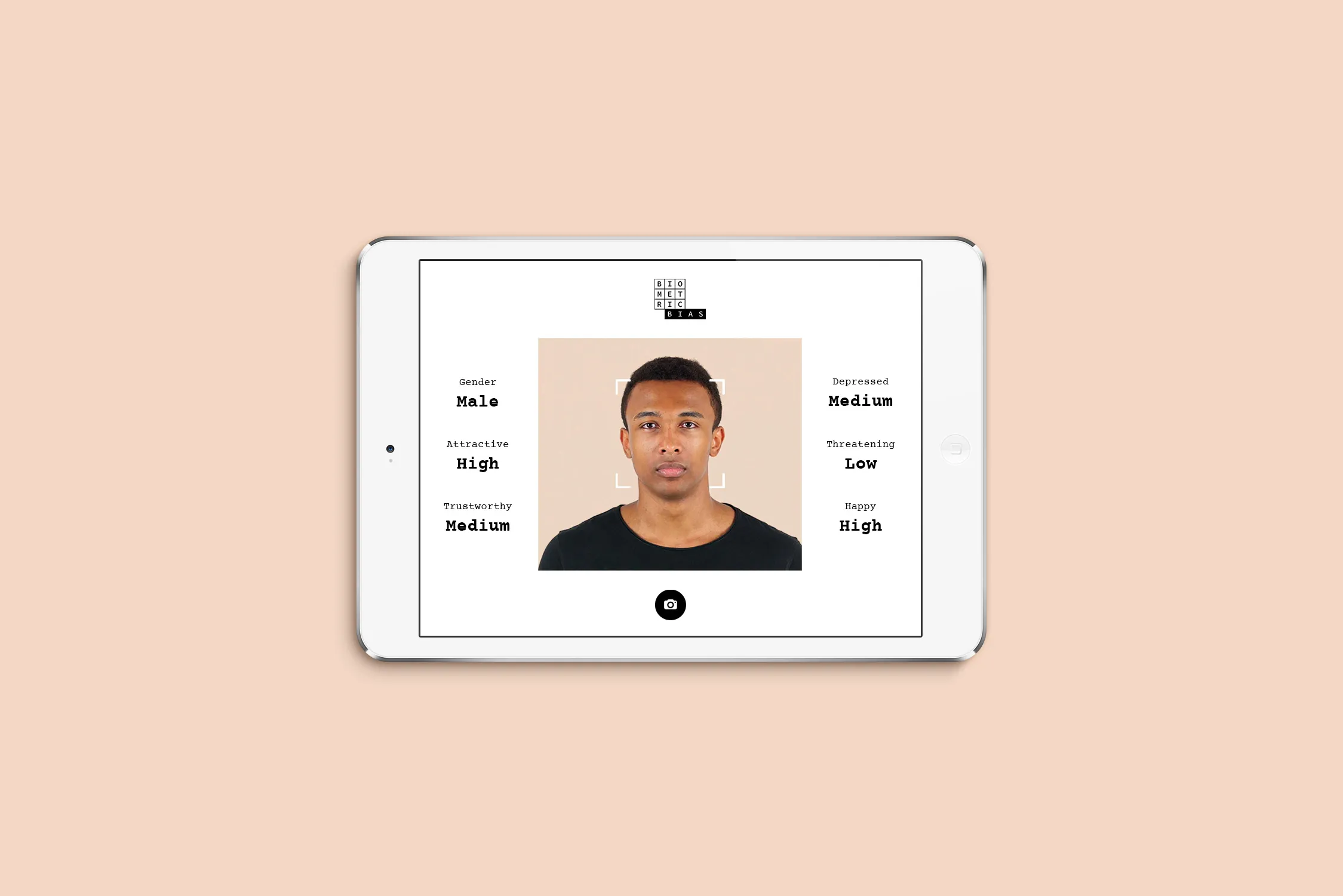
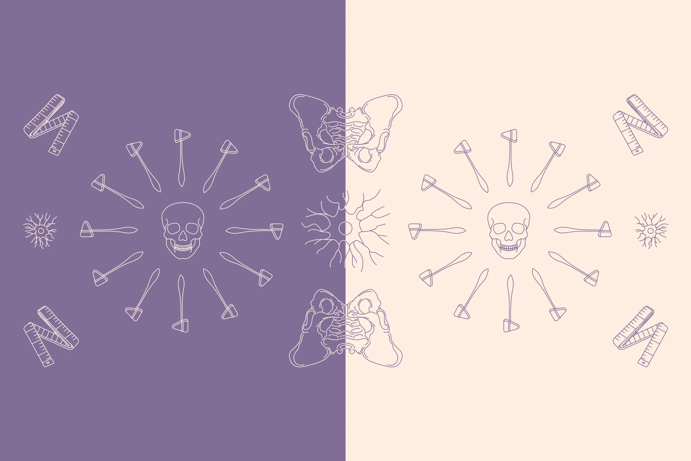
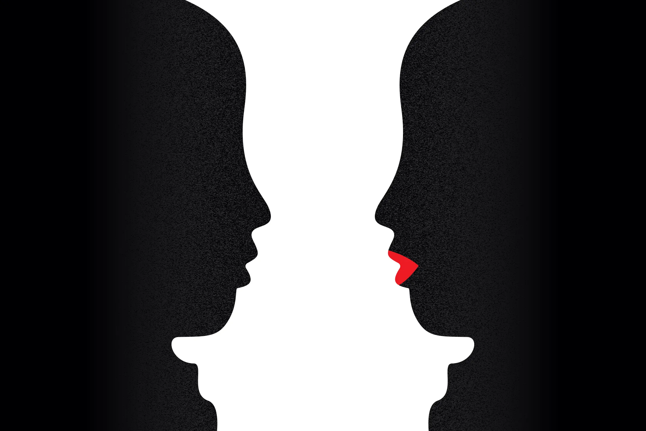
Biometric Bias
Interactive Experience
Glitter & Grit
Branding, Website, Campaign

Banking RFP
Presentation, Video
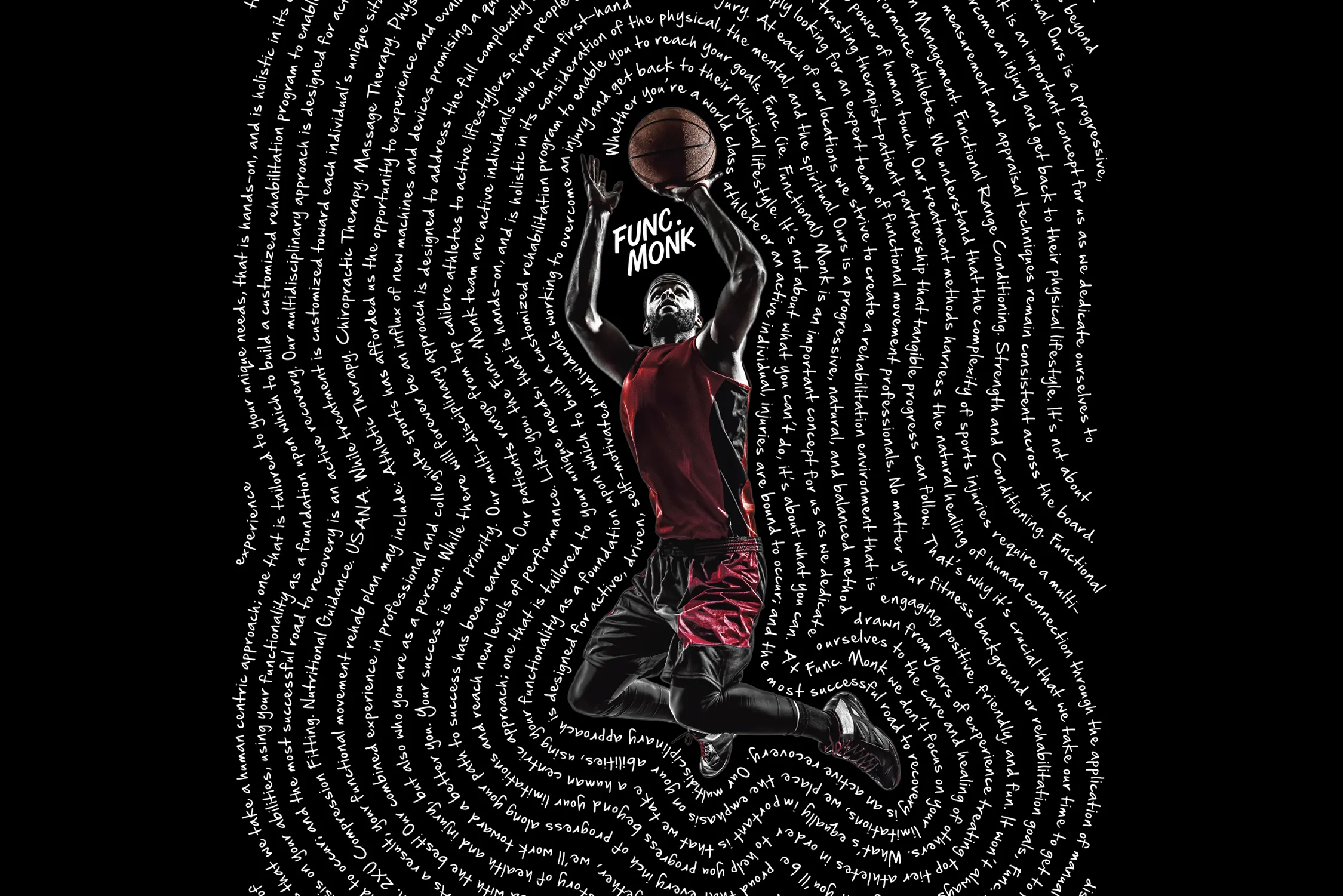
Func. Monk
Branding, Typeface, Website
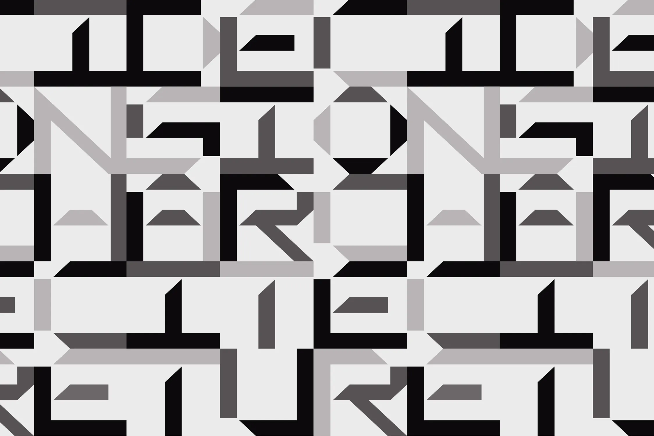
3DM6
Branding, Typeface, Website

Proviso
Branding, Website, Campaign
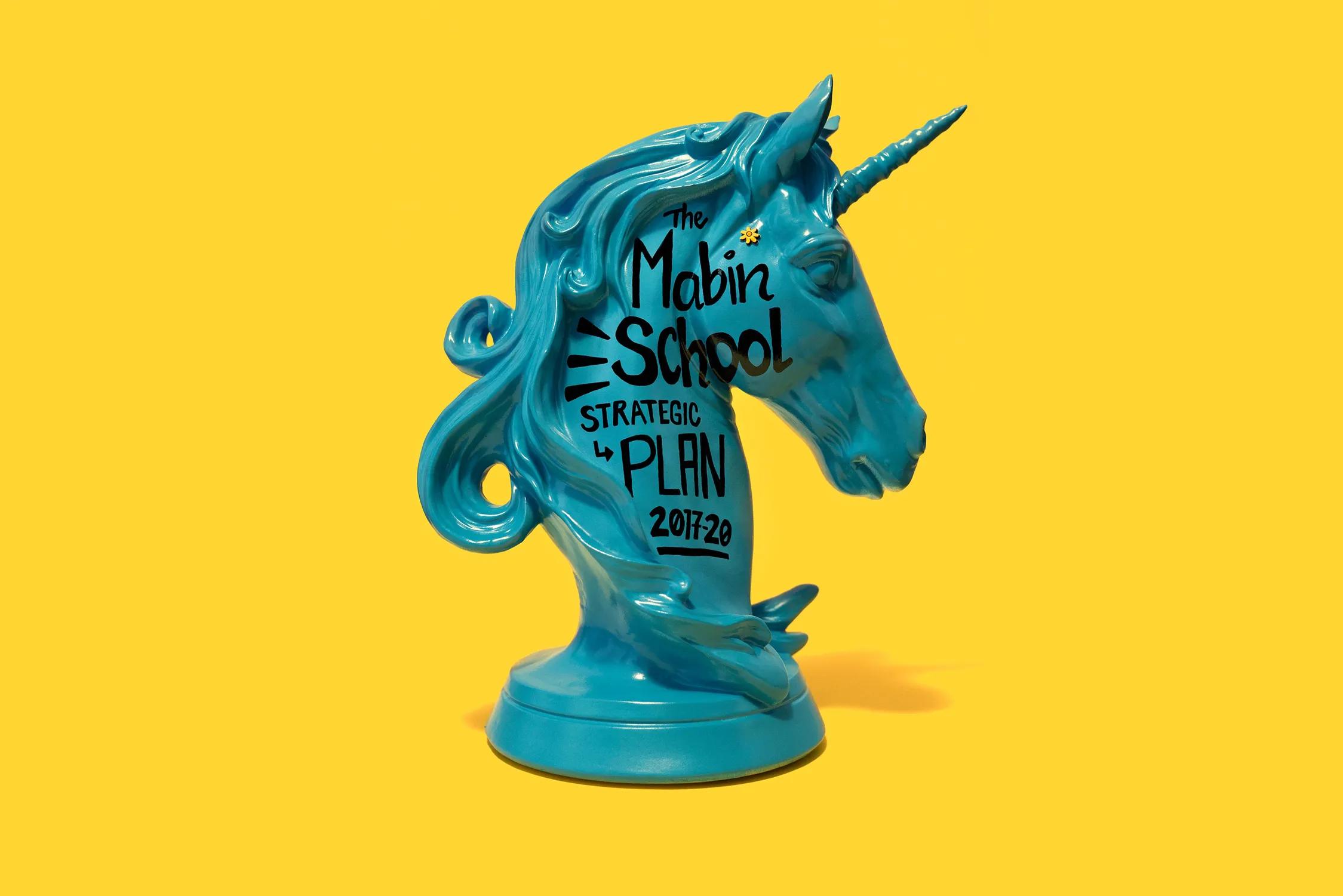
The Mabin School
Editorial

TVM
Branding, Website

Yogen Fruz
Microsite, 3D
Tosh Jeffrey
Branding, Website, Merch
Recover
Branding, Industrial Design
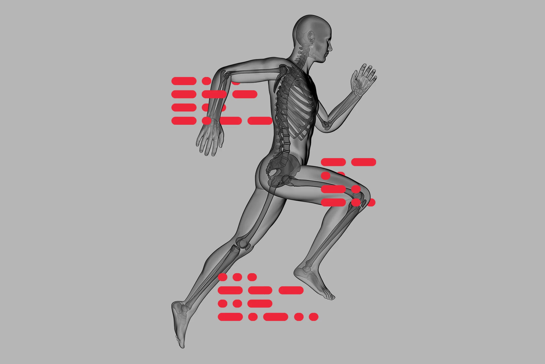
The Movement Lab
Branding, Website
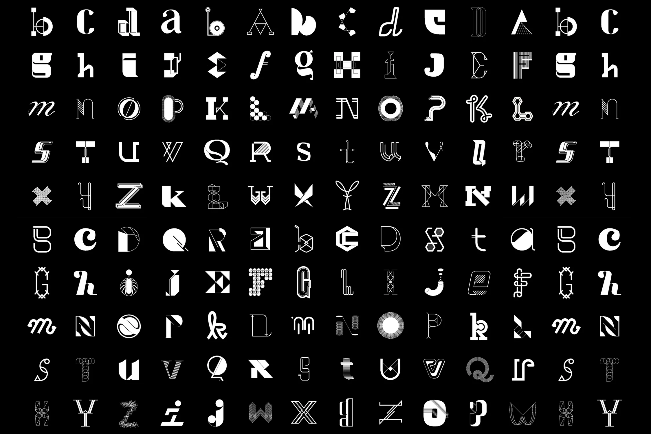
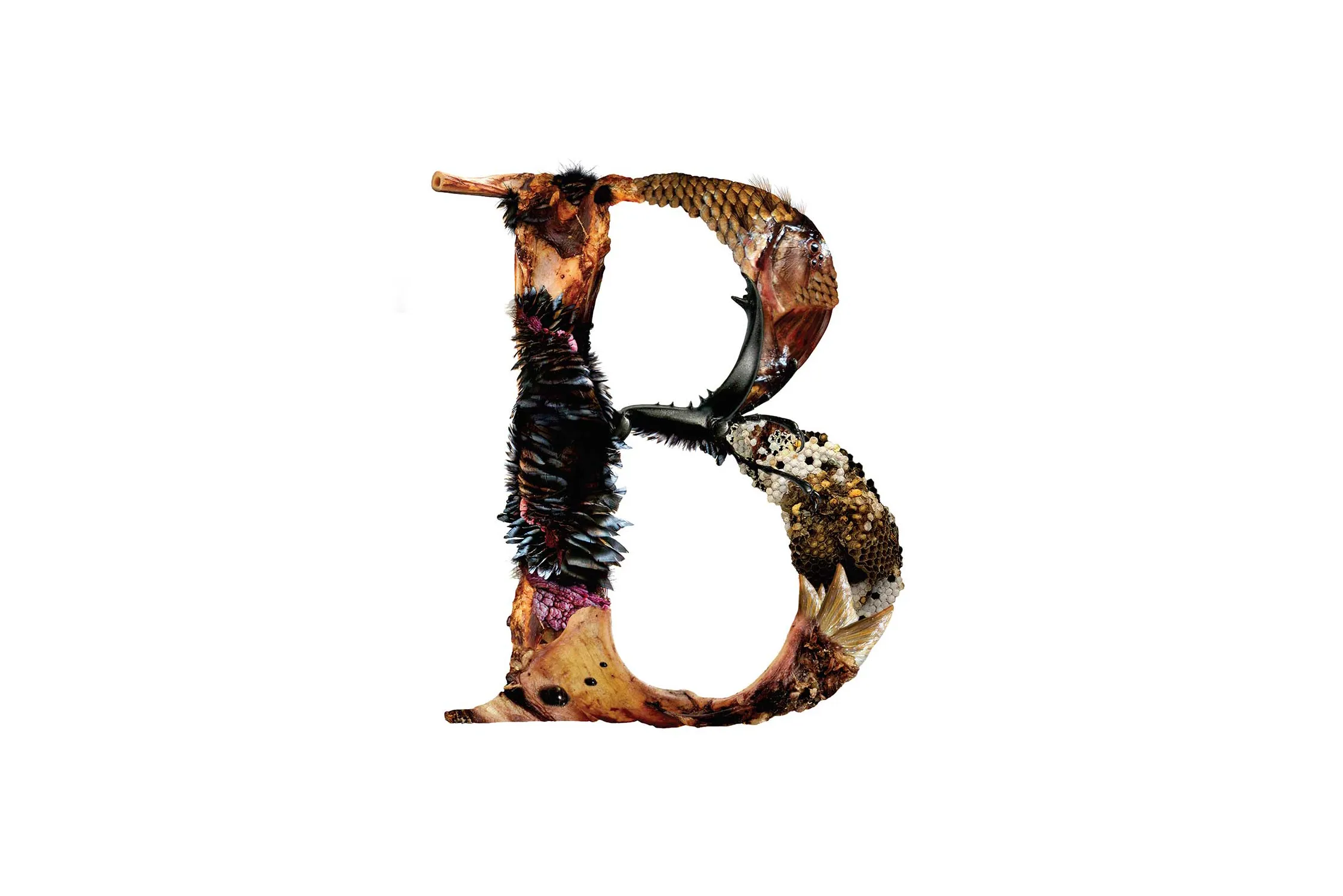
Lettergrams
Lettering
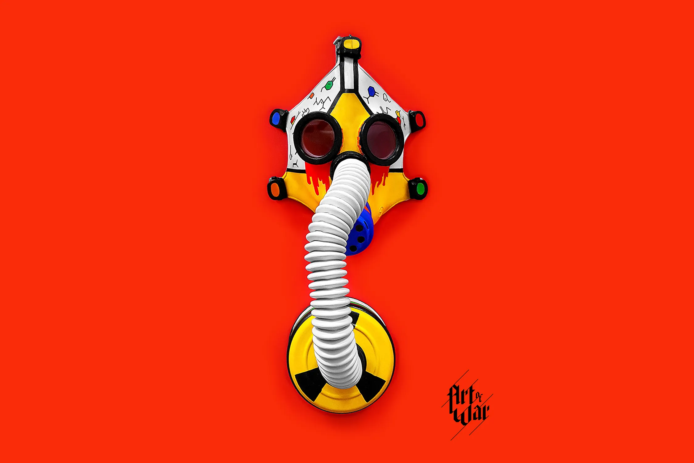
Art of War
Branding, Art Poster Series
Bird Headed Monster
Film Title Lettering
Beyond The Wall
Campaign, Merch
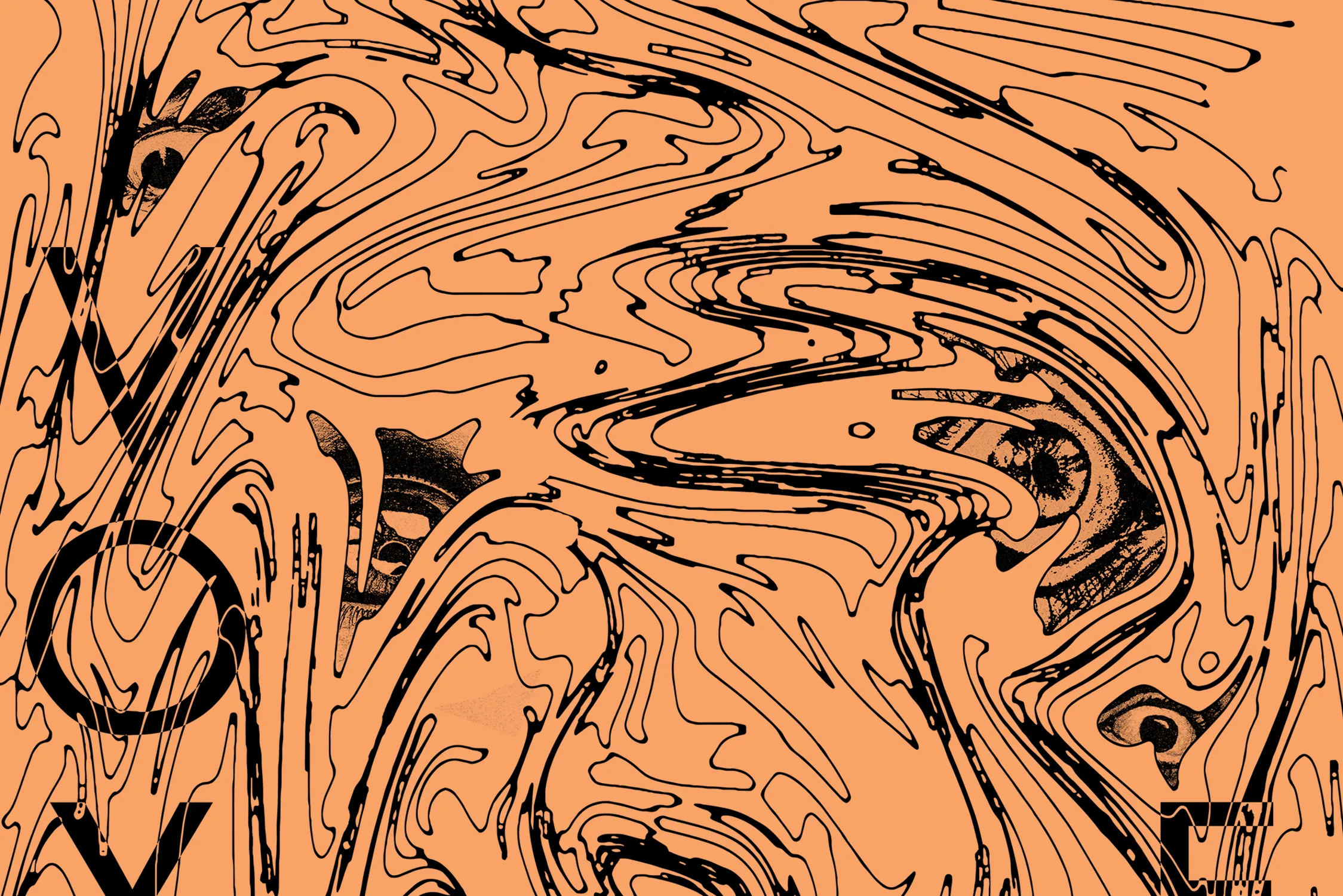
Voyeur
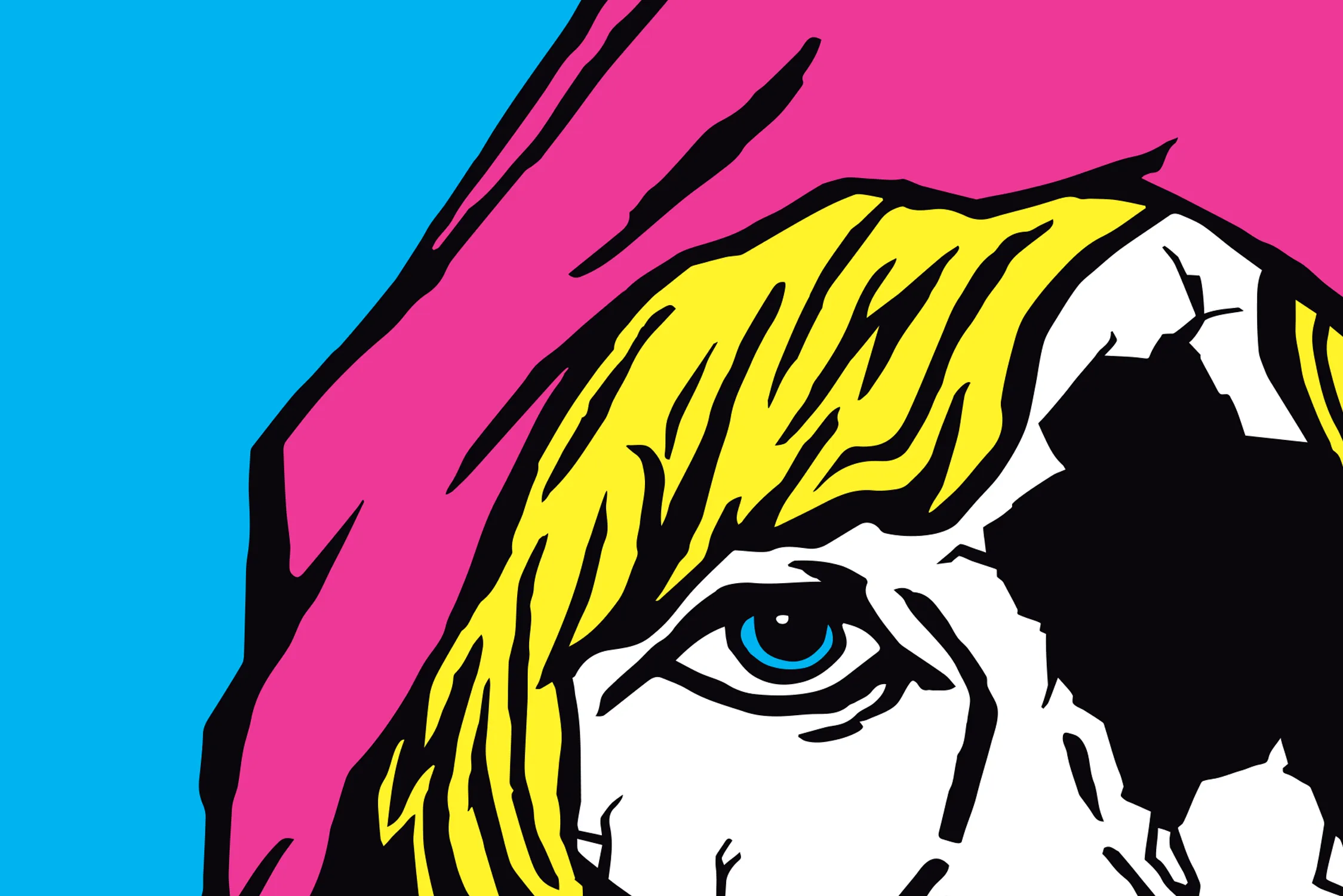
Film Poster, Campaign, Merch
The Honesty Policy
Branding, Website
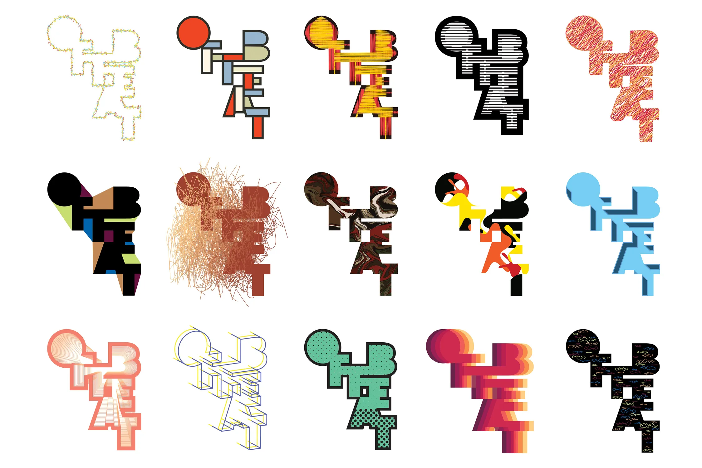
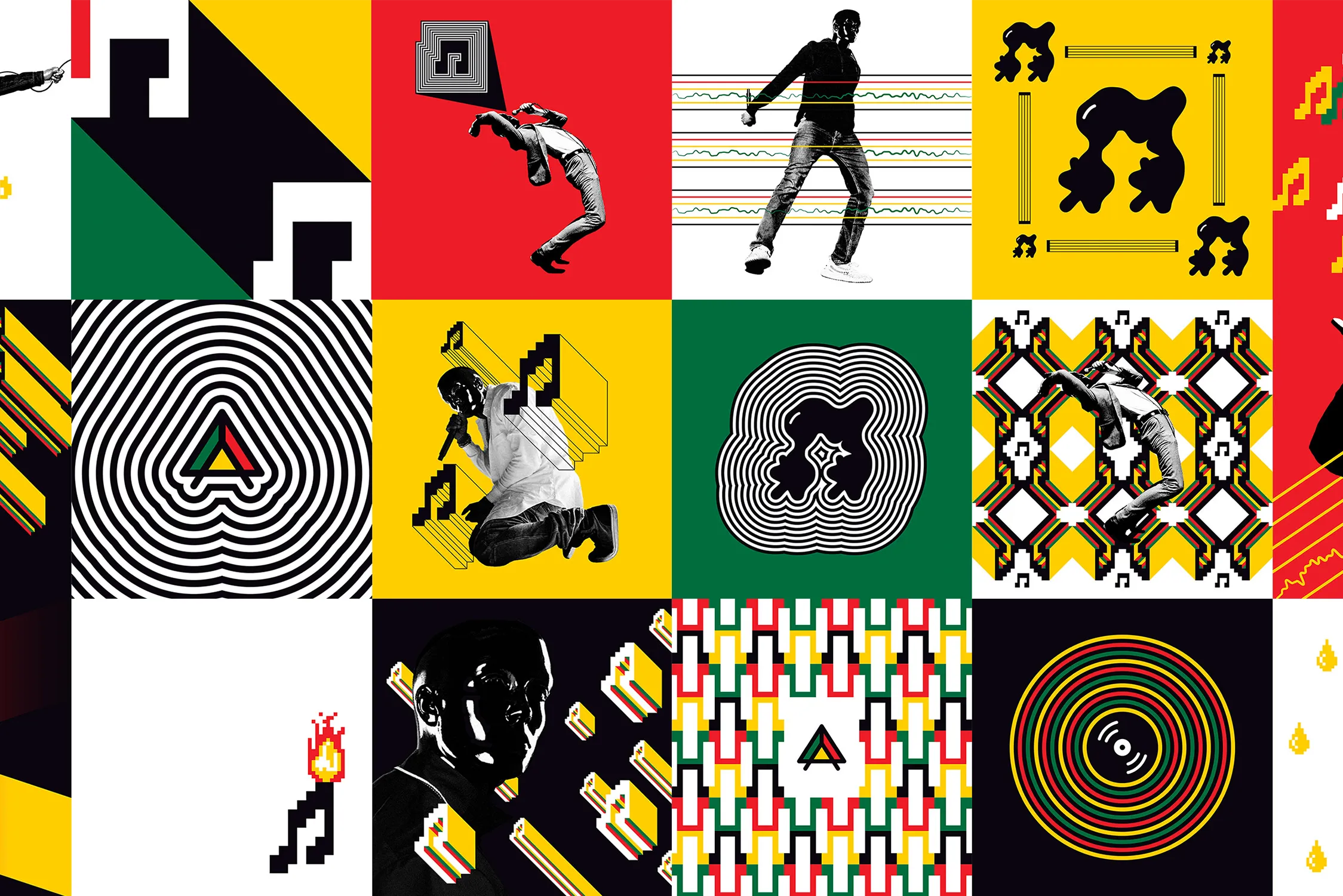
Sir Offbeat
Branding, Album Artwork, Merch
Jet Set Go
Travel Poster Series
Stalemate
Book Cover
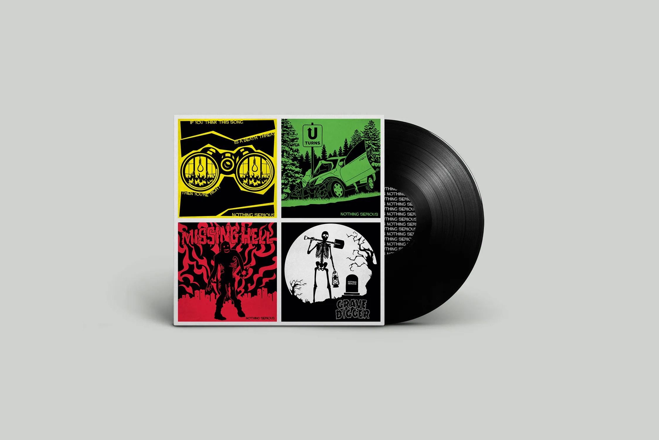
Nothing Serious
Album Artwork, Merch
Komatose
Film Poster Series

Nurolift & Ozmotix
Branding, Packaging, Website
GFH
Branding, Website

Marcelo Dentistry
Campaign, Merch

Verbadjenoun
Illustration, Campaign